Kum & Go
- Midwest
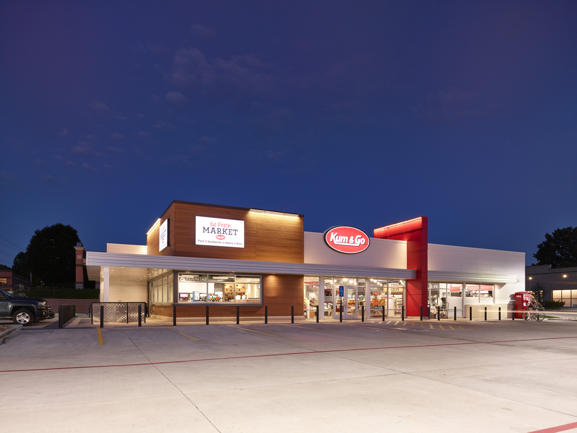
Kum & Go’s Marketplace store design was created to redefine the customer experience, and be a physical representation of the brand’s “Where & Means More” motto.
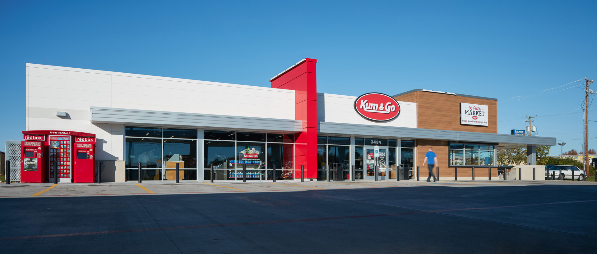
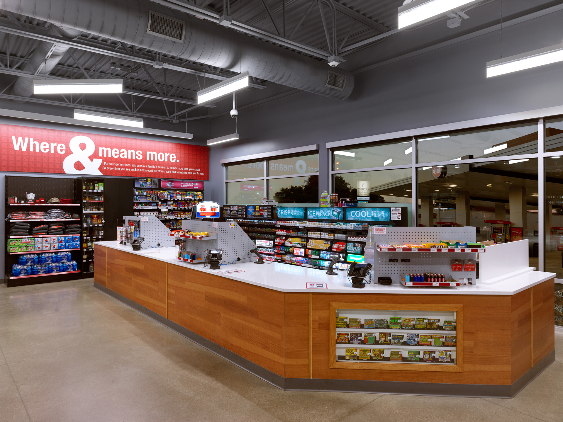
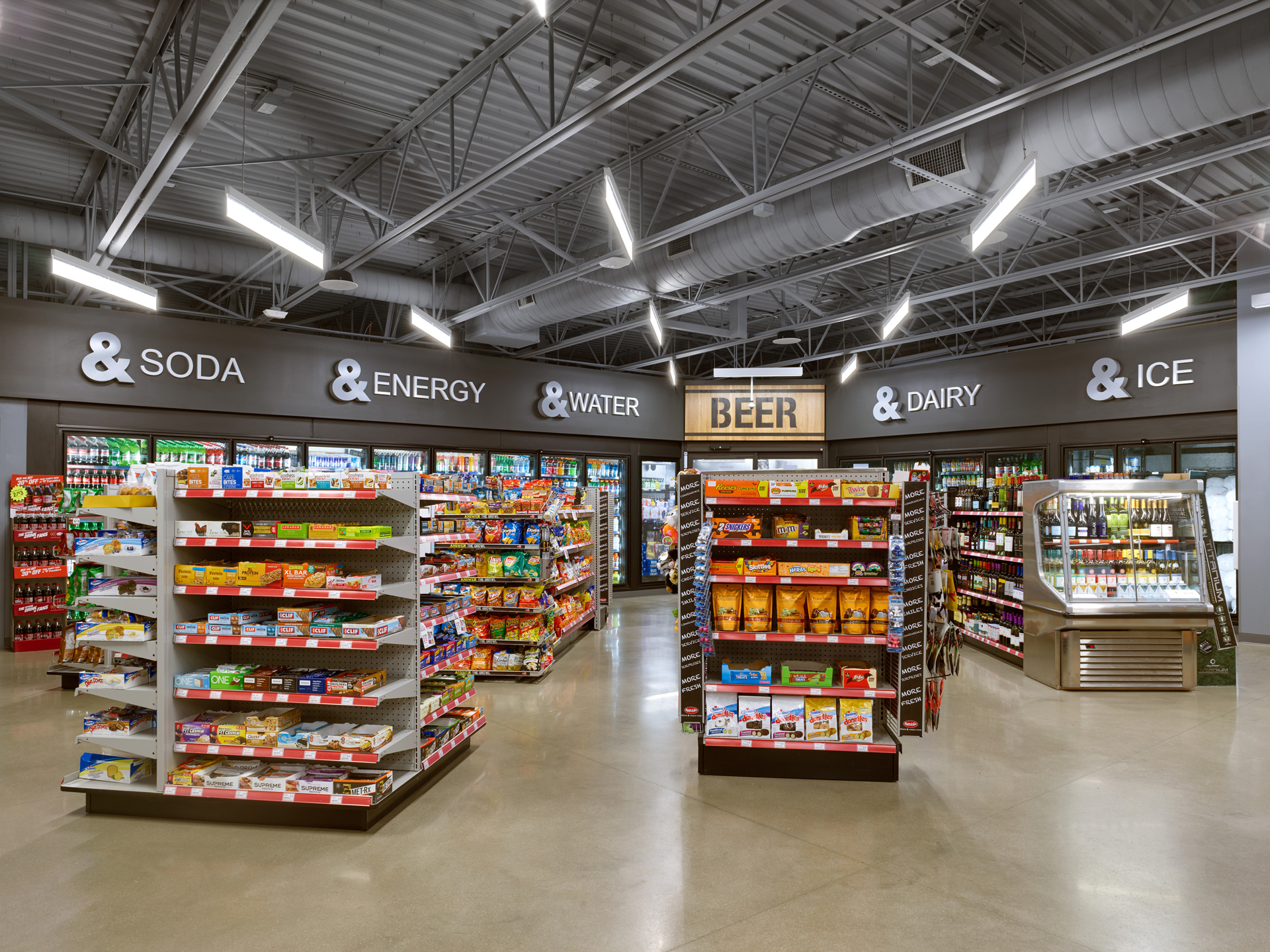
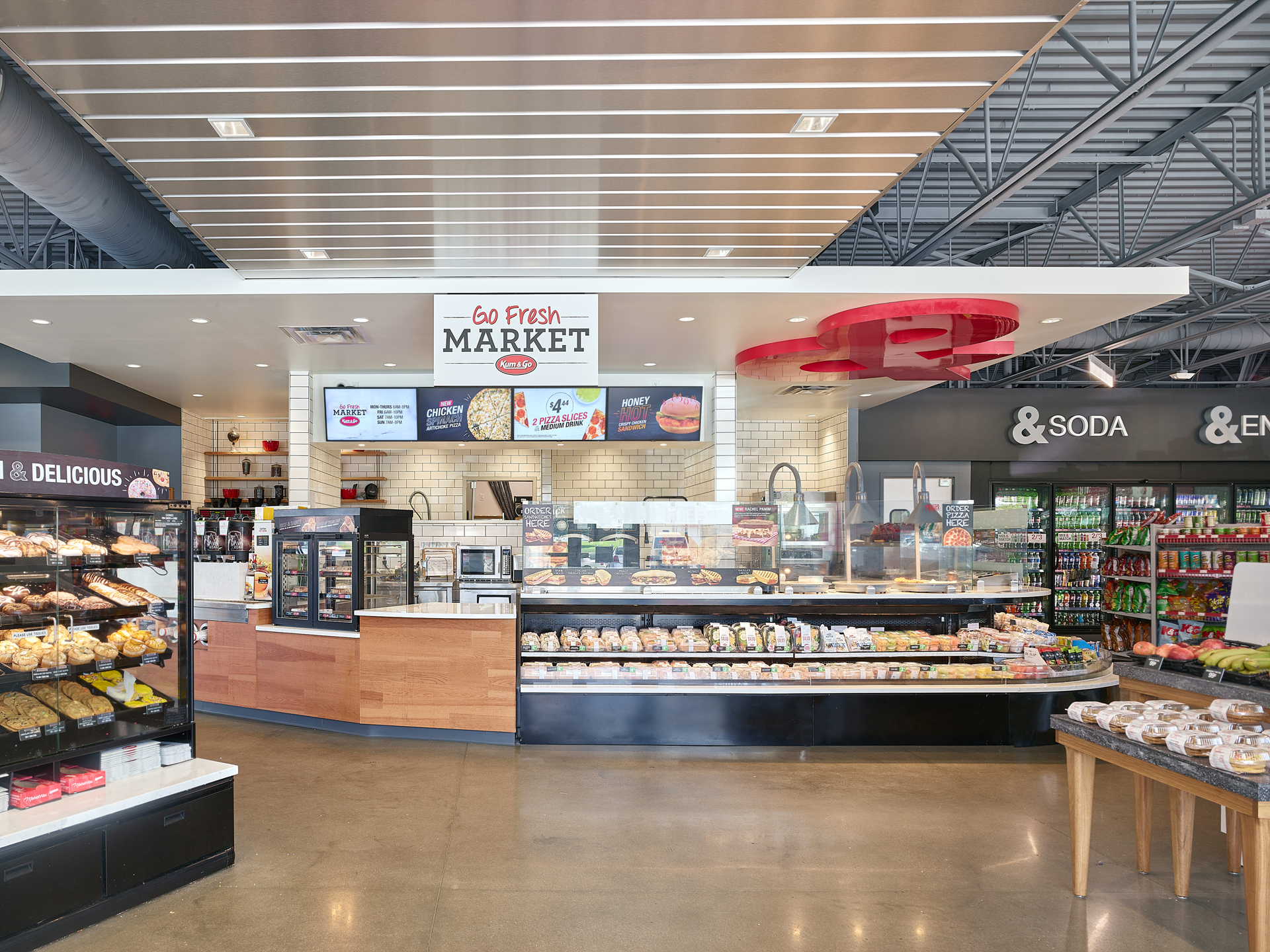
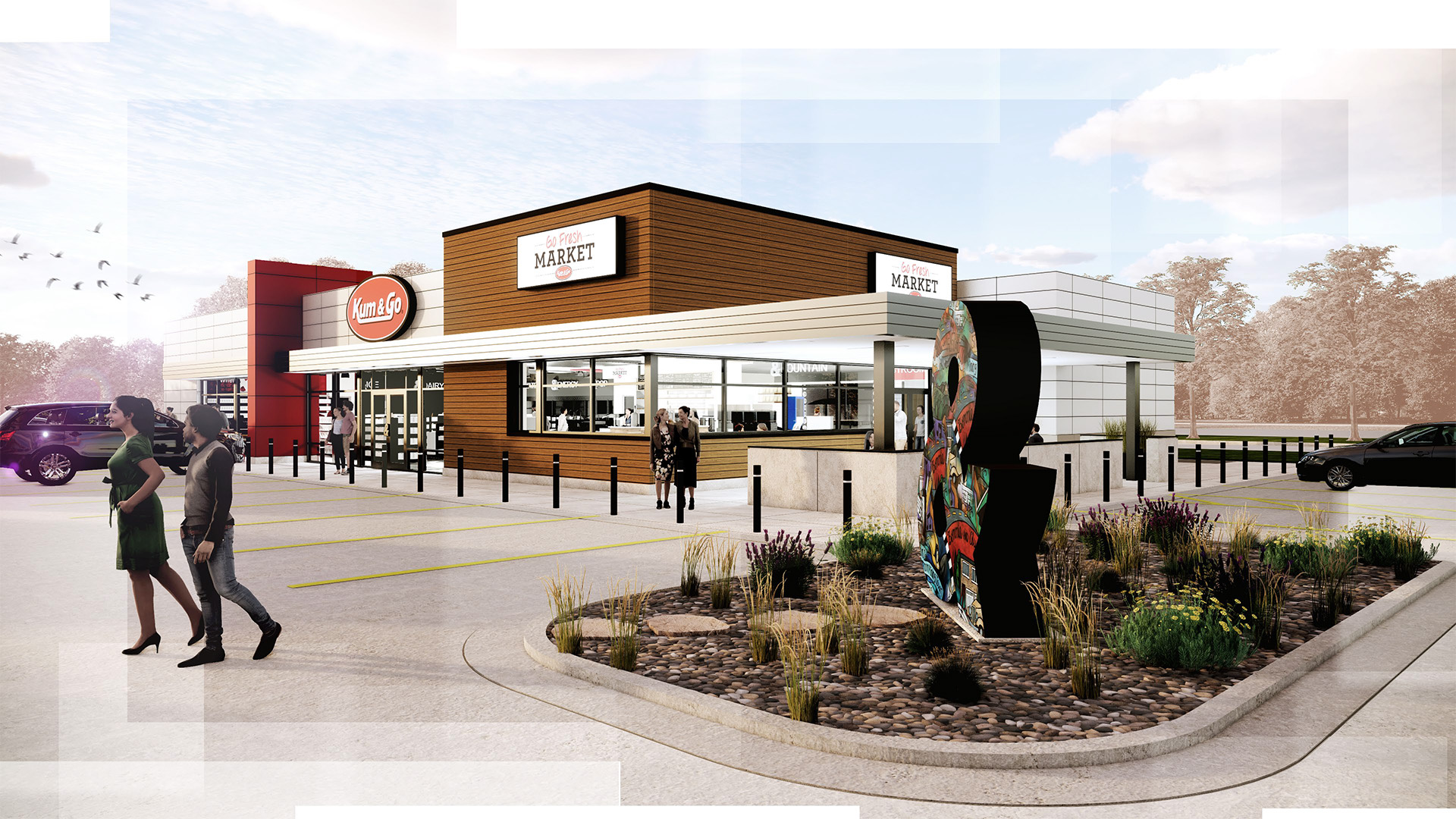
Our team was brought on as a lead architectural partner to further develop the Marketplace concept and rollout the new design. The exterior and interior design features are more contemporary, using neutral color palettes and natural materials as a timeless canvas for Kum & Go’s brand to pop. An open layout with specific “zones”, including the new Go Fresh Market, makes stores easy to navigate. Indoor and outdoor seating, free WiFi, changing stations and growler stations all contribute to a store environment where guests can relax and take their time; while express checkouts cater to customers who need to keep their stop quick.
- MarketRetail & Shopping Centers
- Square FeetAvg. 6,000
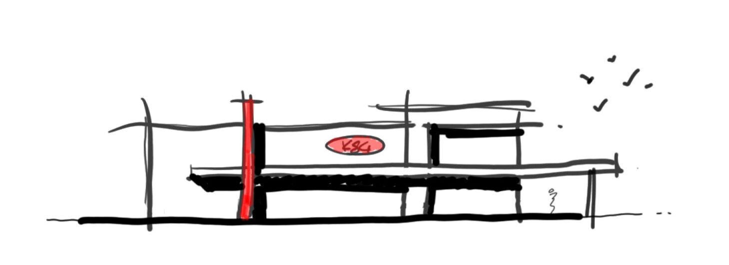
- ServicesArchitectural Design & Illustration
Entitlement
Prototype Development & Rollout
Sustainable Design
BIM
Construction Document Production
Permitting
Construction Administration
Designed for Distinction
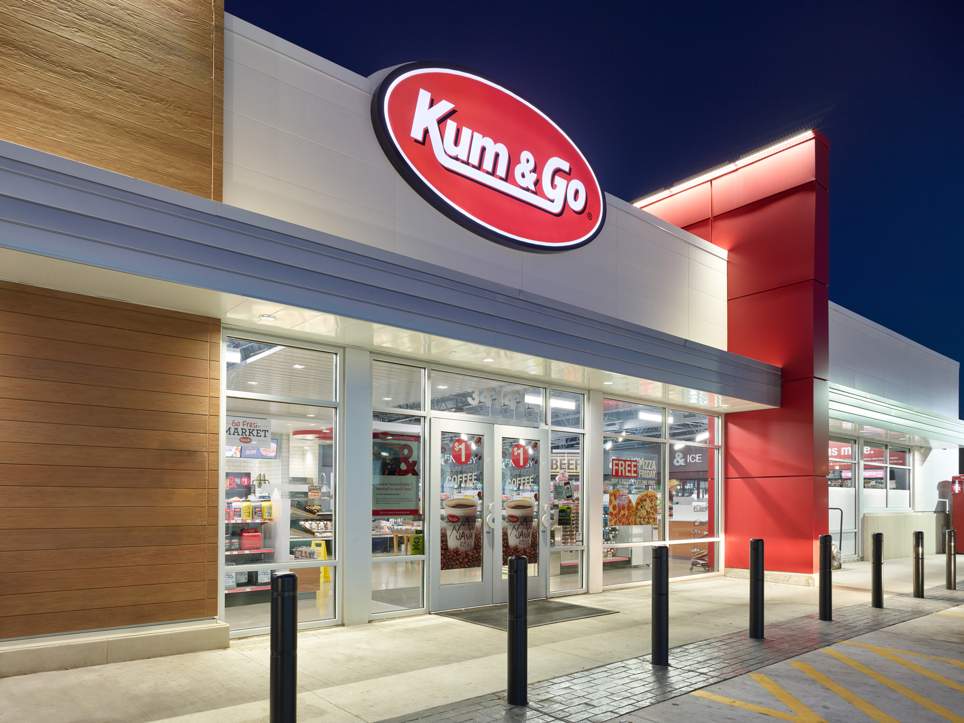
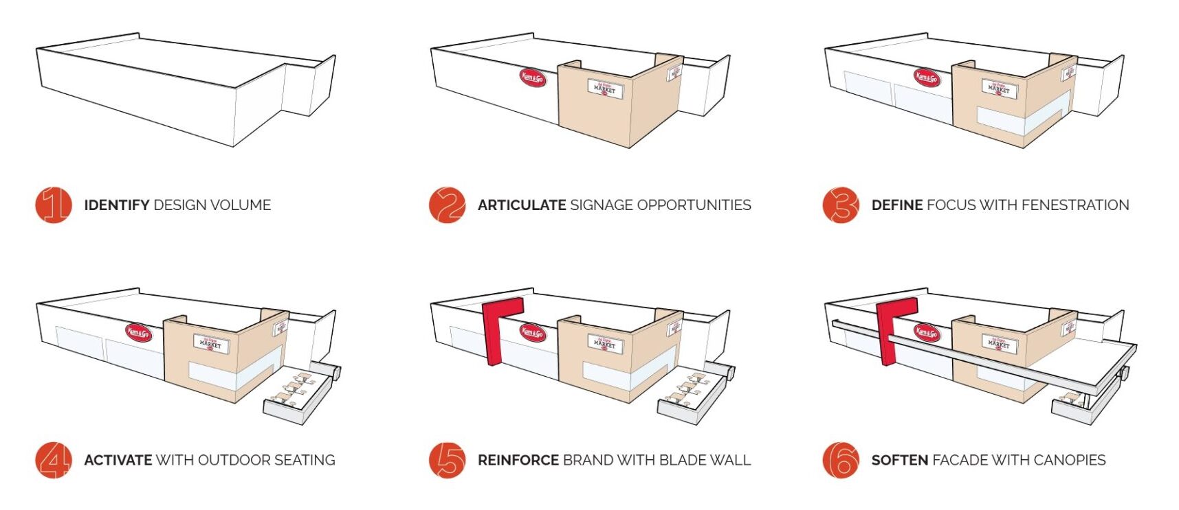
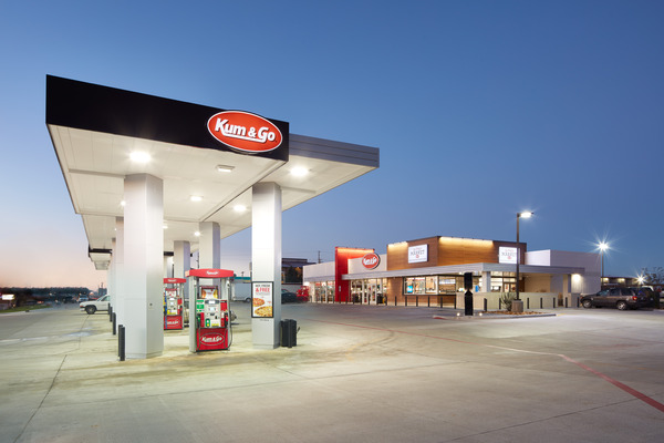
The modern exterior of Kum & Go sets it apart from other fuel station competitors and reinforces the brand with its signature red blade wall.
Integrating with the community
Life-size artwork at various stores helps localize the brand, and demonstrate Kum & Go’s commitment to improving its communities.
